Role: Creative Director
Company: Rounded Design Limited
Client: Campaign for Nuclear Disarmament
Company: Rounded Design Limited
Client: Campaign for Nuclear Disarmament

The Campaign for Nuclear Disarmament is Britain’s leading organisation for peace and anti-nuclear action. Formed in 1958 with the now iconic and internationally recognised peace symbol, they are a community of tens of thousands of activists sharing a common vision for a world without war. From award-winning peace education work and parliamentary engagement, to joining millions marching on the streets, CND work with all people who believe in peace, justice and a nuclear-free future.
CND’s brand identity had become tired and dated, with several versions of the logo in use. Together we reviewed the current brand and communications, and developed a new brand strategy and creative brief. We were asked to develop the brand identity to clearly communicate both the sense of urgency around their cause and their inspirational activism. While also reflecting the strong values and reputation of this iconic movement. The new brand needed to help engage wider and younger audiences, while not alienating their current members.
While we always aimed to create something new and contemporary, we also felt it was important to create something that recognised CND’s 65 year history. For inspiration we looked to the work of designer Ken Garland and artist Peter Kennard who both produced outstanding work for CND in the 60’s and 80’s respectively. Also designer David King who worked with CND in the early 60’s and also produced brilliant work for both the Anti Nazi League and Anti Apartheid Movement.
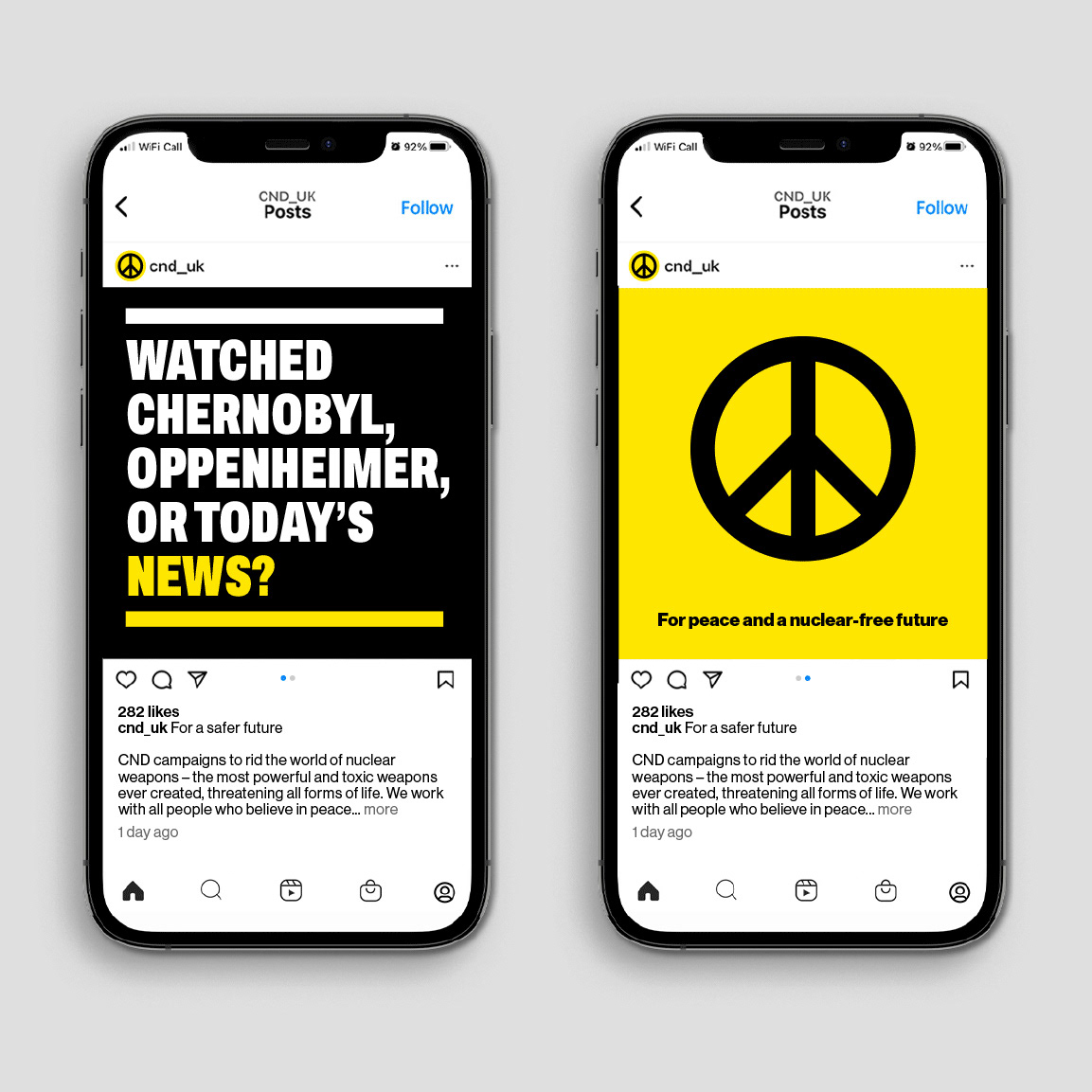
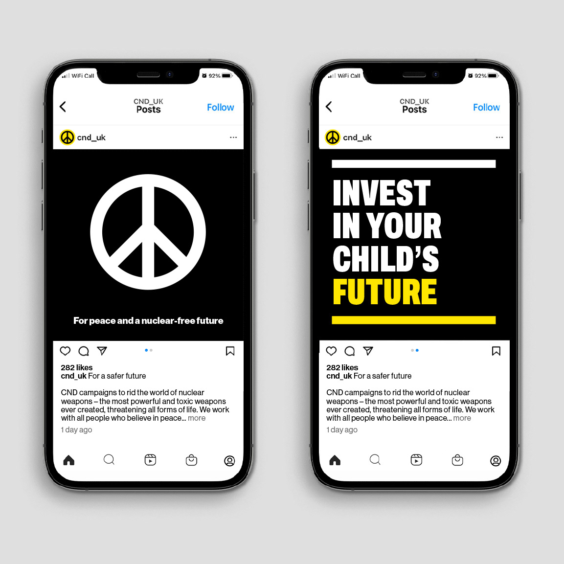
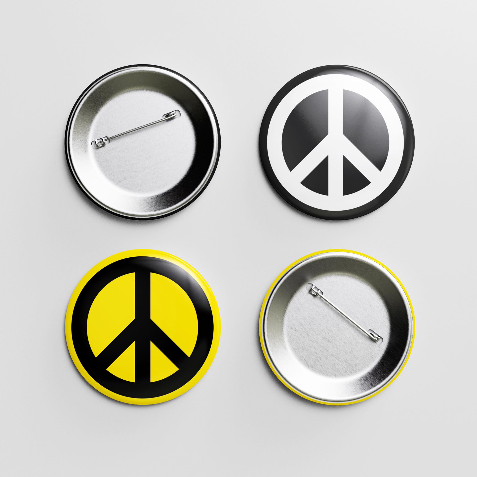
CND have one of the best known logos in the world, the now iconic and internationally recognised peace symbol (design by Gerald Holtom in 1958). We obviously had no wish to make radical changes, but carefully redrew and adjusted the symbol to create a standardised, contemporary version, fit for CND’s future and all it’s digital and print communications.
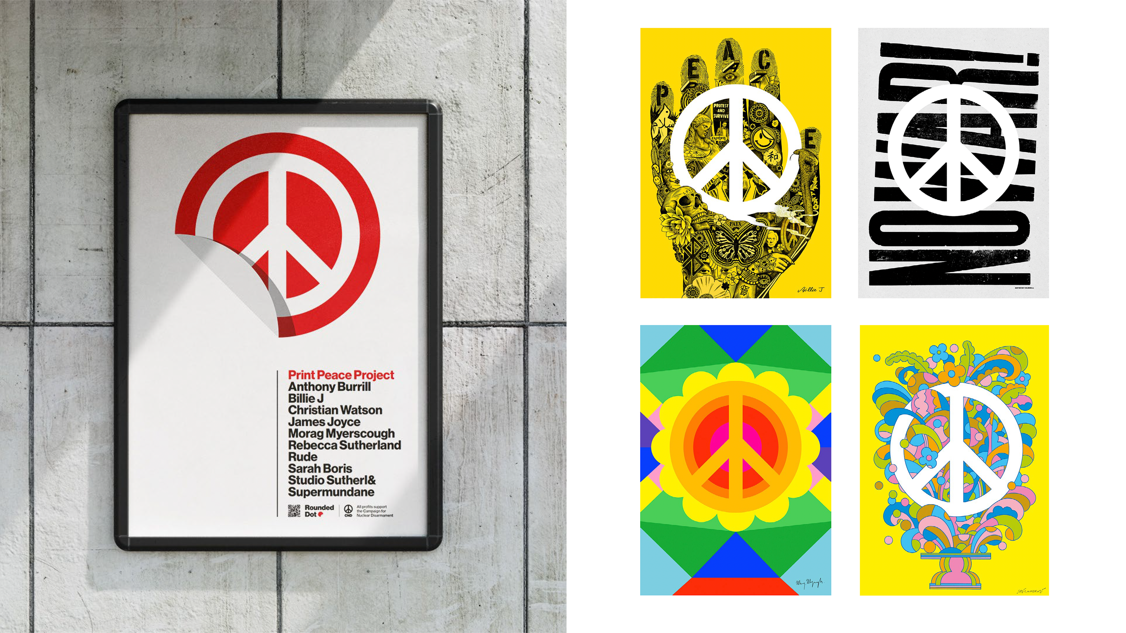
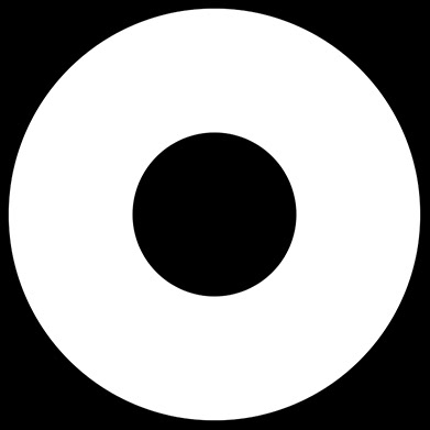
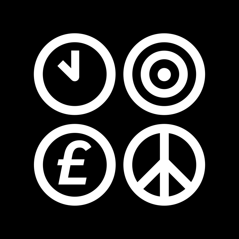
The symbol has two versions. One line based and one based on the negative space it creates (I believe created by Ken Garland). Both have history and value, so we rationalised their use, making the line based version CND’s logo and the negative space version a graphic asset for use in communications to help create dynamic design layouts.
CND have one of the best known logos in the world, the now iconic and internationally recognised peace symbol (design by Gerald Holtom in 1958). We obviously had no wish to make radical changes, but carefully redrew and adjusted the symbol to create a standardised, contemporary version, fit for CND’s future and all it’s digital and print communications.
The symbol has two versions. One line based and one based on the negative space it creates (I believe created by Ken Garland). Both have history and value, so we rationalised their use, making the line based version CND’s logo and the negative space version a graphic asset for use in communications to help create dynamic design layouts.
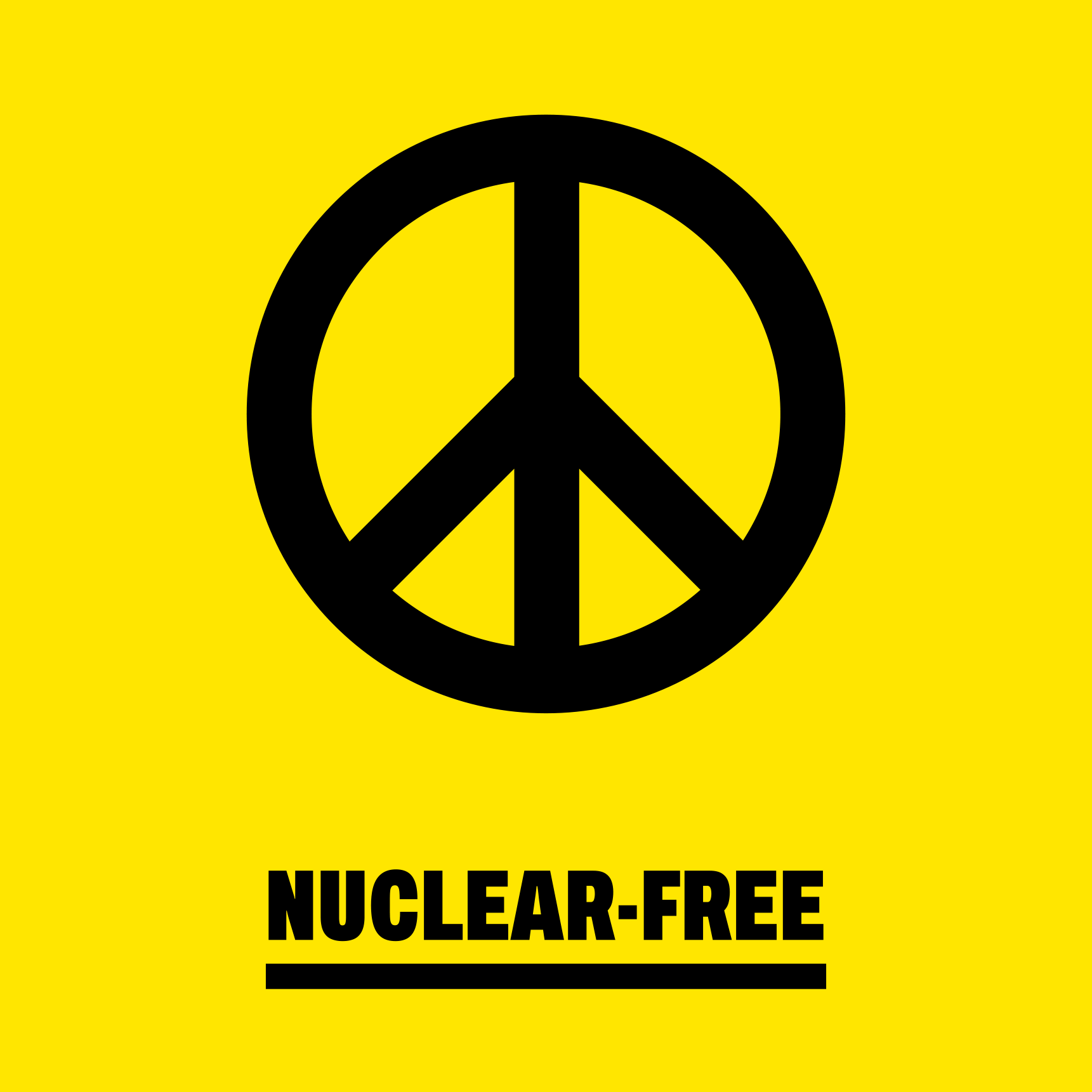
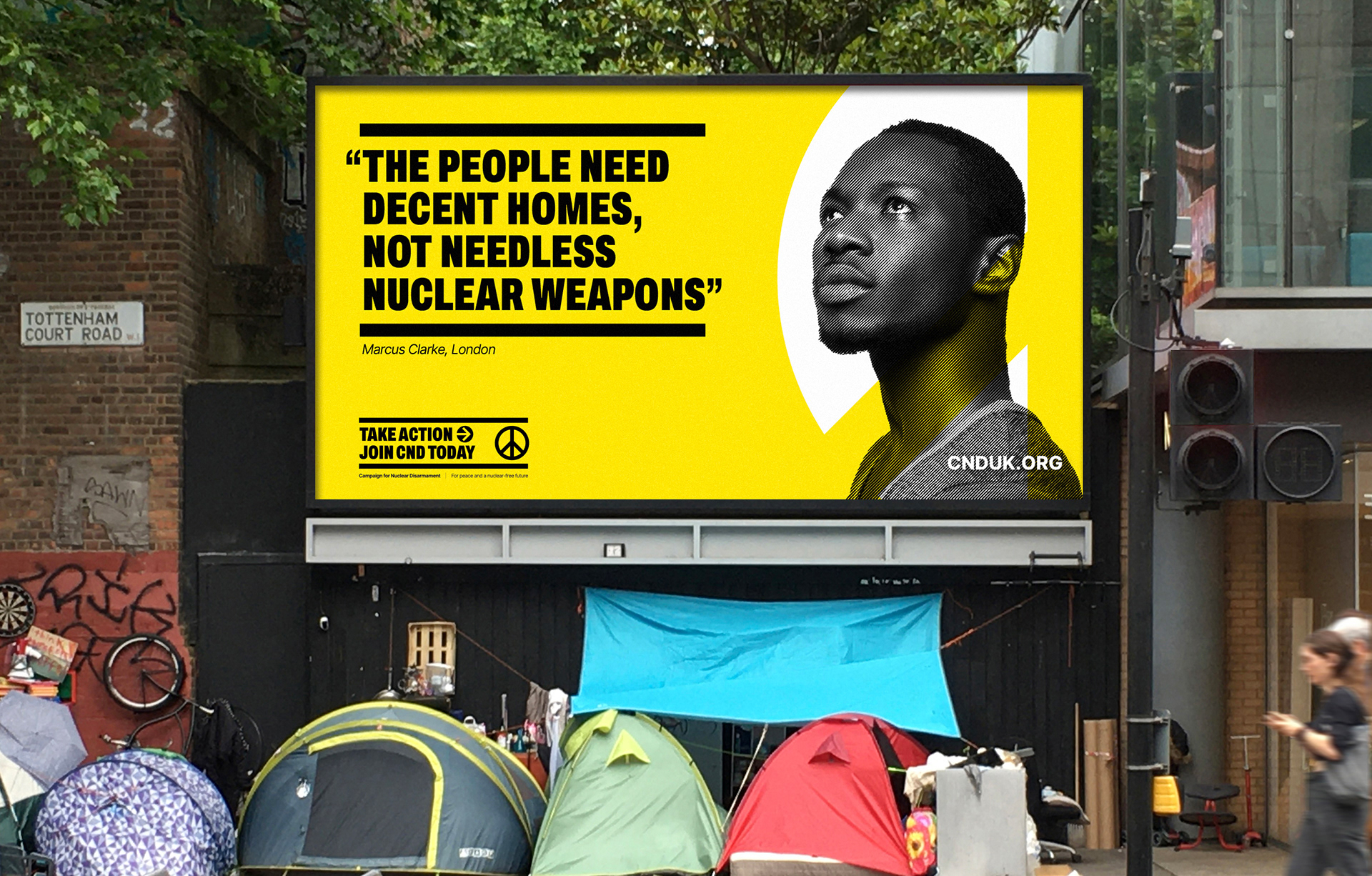
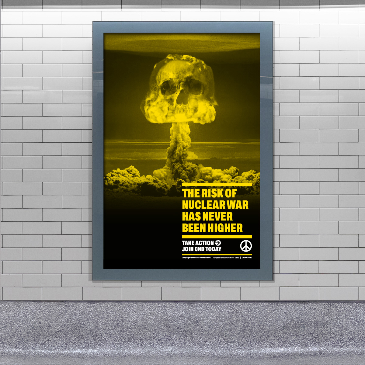
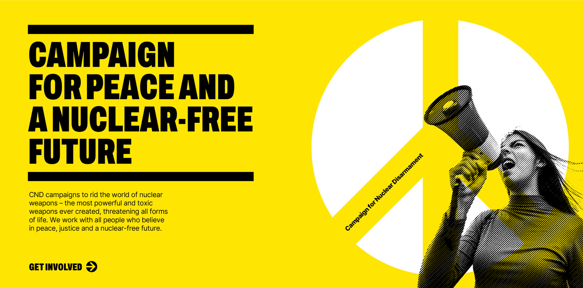
The use of black and white is a strength of CND’s brand historically. This was something we wanted to retain, but we also wanted to refresh things with a new key colour. We agreed on a bright yellow as it’s visually striking and has associations with nuclear warning signs. It is also the colour of National CND’s main banner for protests and marches.
Part of our brief was to use Open Source typefaces so that they could be accessed freely across the organisation. This felt like a challenge, but after a lot searching we decided on Archivo Extra Condensed Black for headlines. The typeface feels modern and has a sense of urgency, while not feeling unfriendly. Headlines are framed with heavy rules to add emphasis and create impact. For text we chose Inter, a classic modern sans serif that is clean and accessible.
A distinctive CND style is created with black and white photography of CND activists and members, overlaid on the brand yellow. A halftone filter is applied at 45 degrees to link back to the angled arms of the logo.
Project deliverables: Brand strategy, key messaging & tone of voice, visual identity system and brand guidelines. The brand launched in October 2024 with a new membership recruitment campaign.